Unveiling the Vision: Forging Believe Shelters' Brand Identity with Precision and Purpose
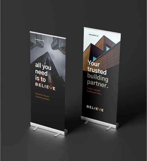
Brand Identity, Signage & Environmental Graphics
Our recent collaboration with Believe Shelters, a pioneering construction company based in Nigeria, exemplifies our commitment to daring creativity and innovative thinking.
Believe Shelters isn't just another construction company; it's a beacon of inspiration, a testament to the power of daring to be different. Their motto, "Dare to be different," summarizes their principles—to break free from the confines of convention, to challenge norms, and to redefine what's possible in the realm of construction.
As a group of accomplished pioneers in architectural design, technology, and collaborative construction, Believe Shelters needed a brand identity that mirrored their passion for innovation and excellence. That's where we came in.
Why did Believe Shelters choose our company? Because they recognized in us a shared fervor for pushing boundaries and a commitment to exactitude in every endeavor. They saw in our portfolio the same dedication to creativity and precision that they bring to their own creations.
Our collaboration with Believe Shelters was more than just a project; it was a journey of discovery and co-creation. We delved deep into their vision, understanding not just what they do, but why they do it. Together, we crafted a brand identity that would set them apart in the competitive construction landscape while staying true to their core values.
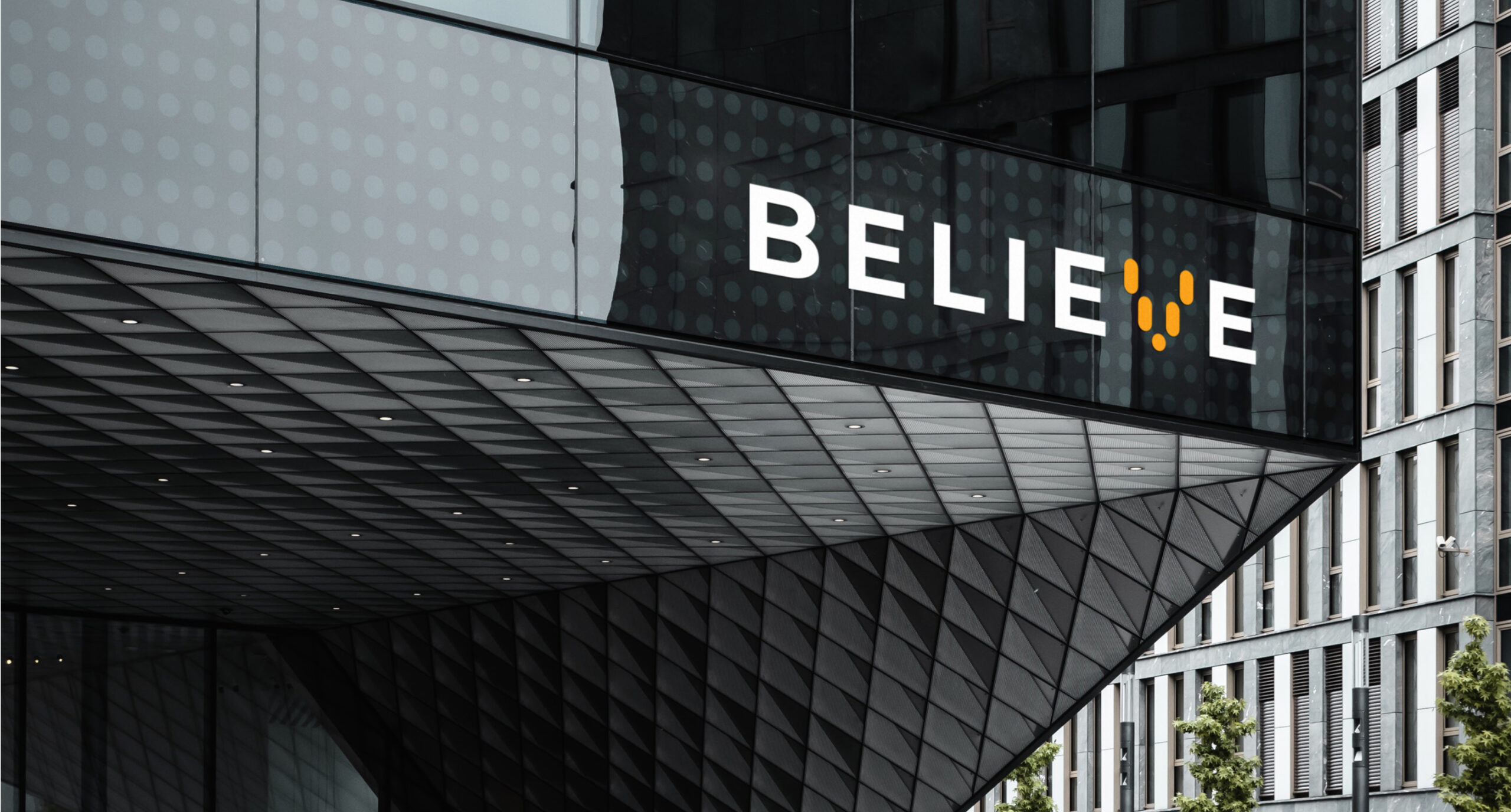
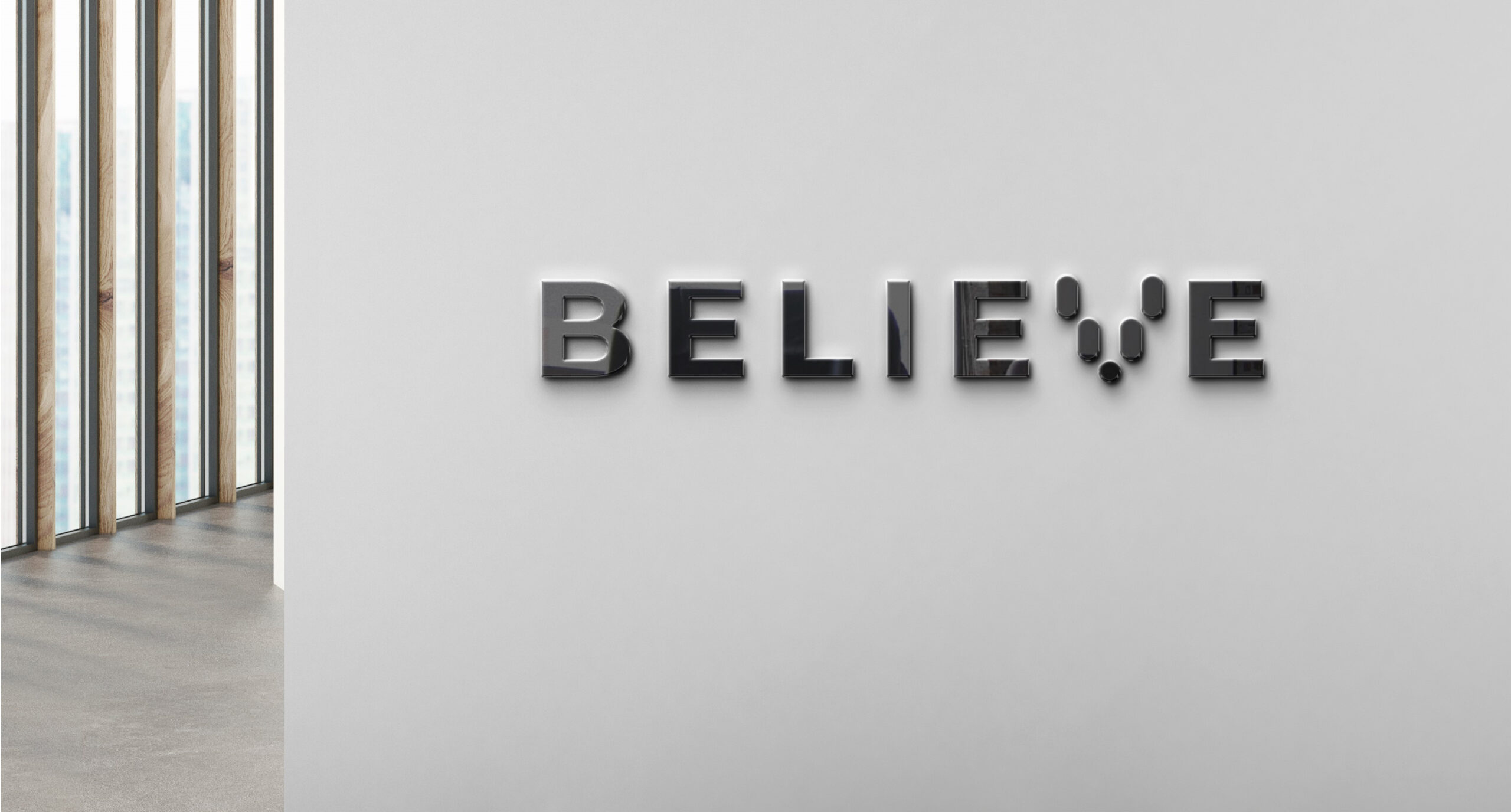
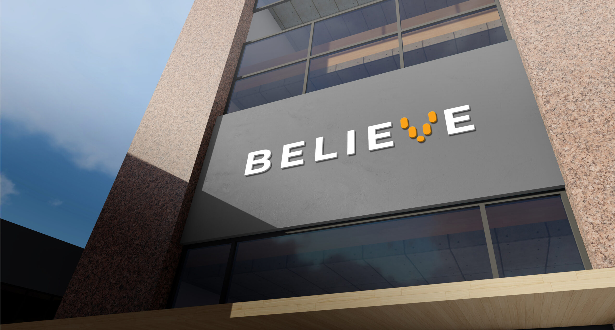
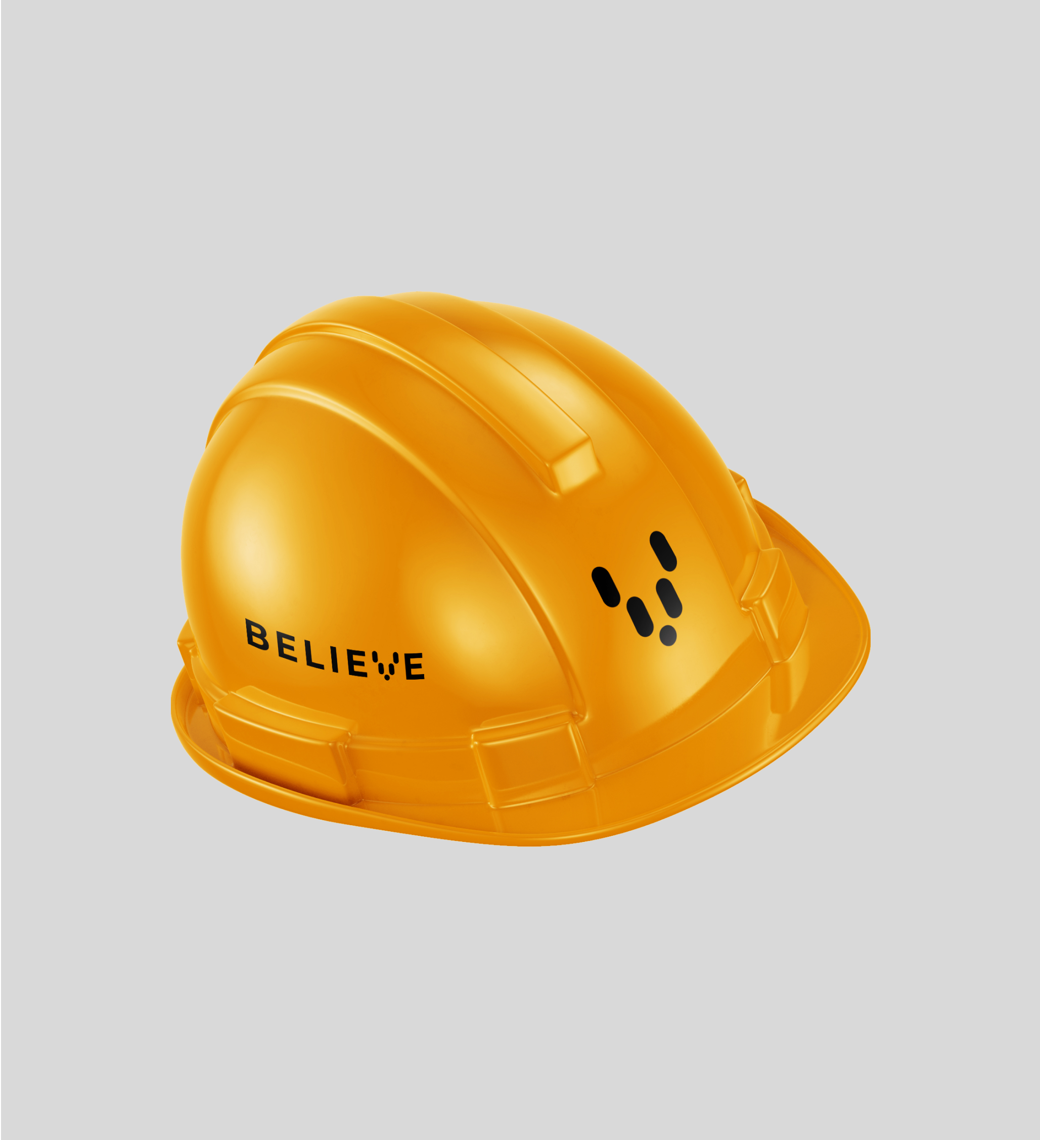
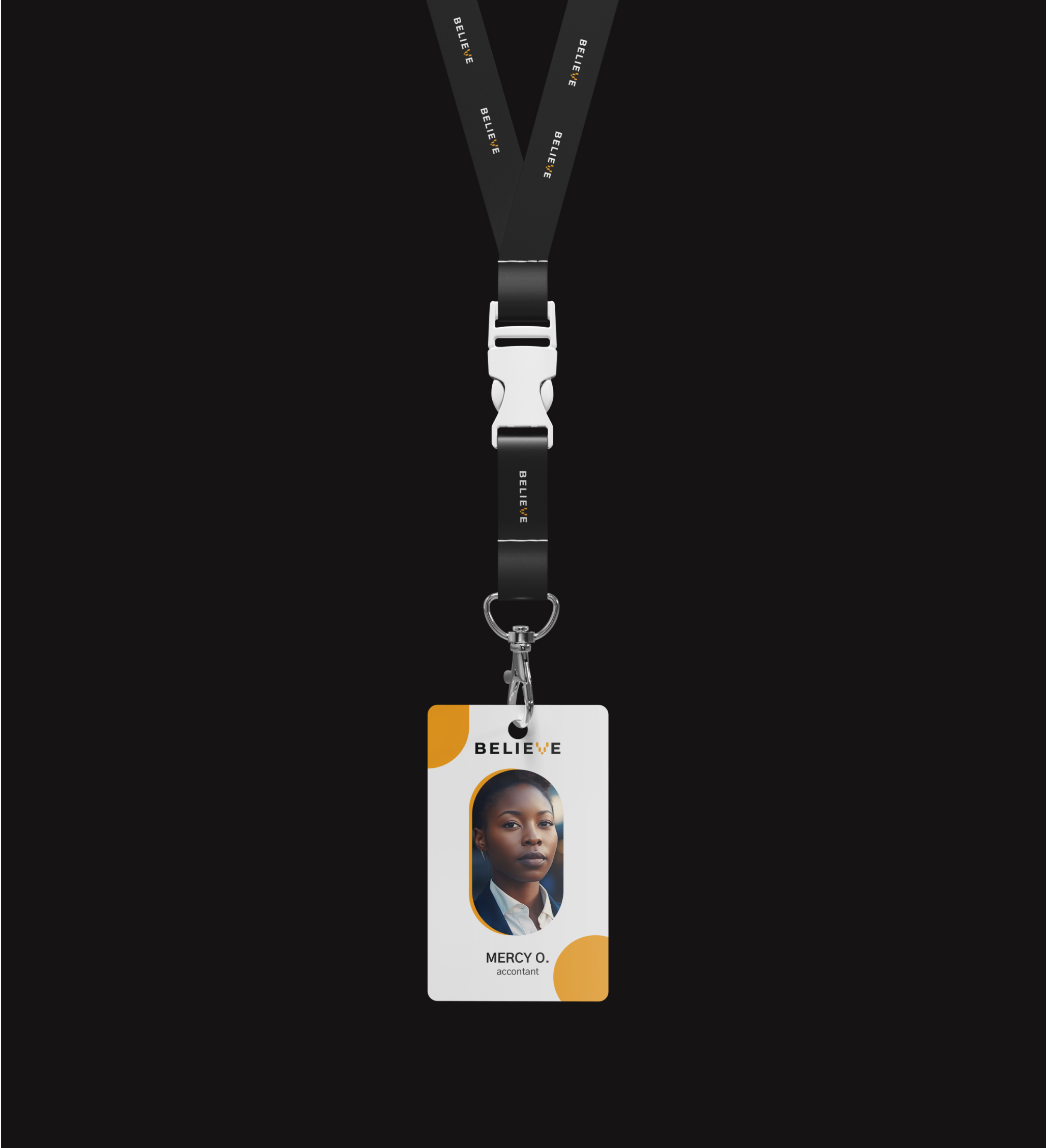
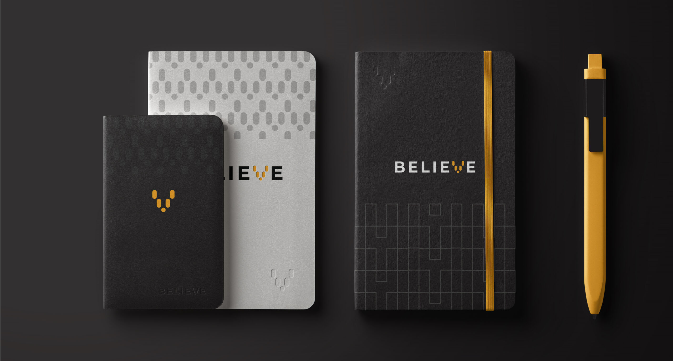
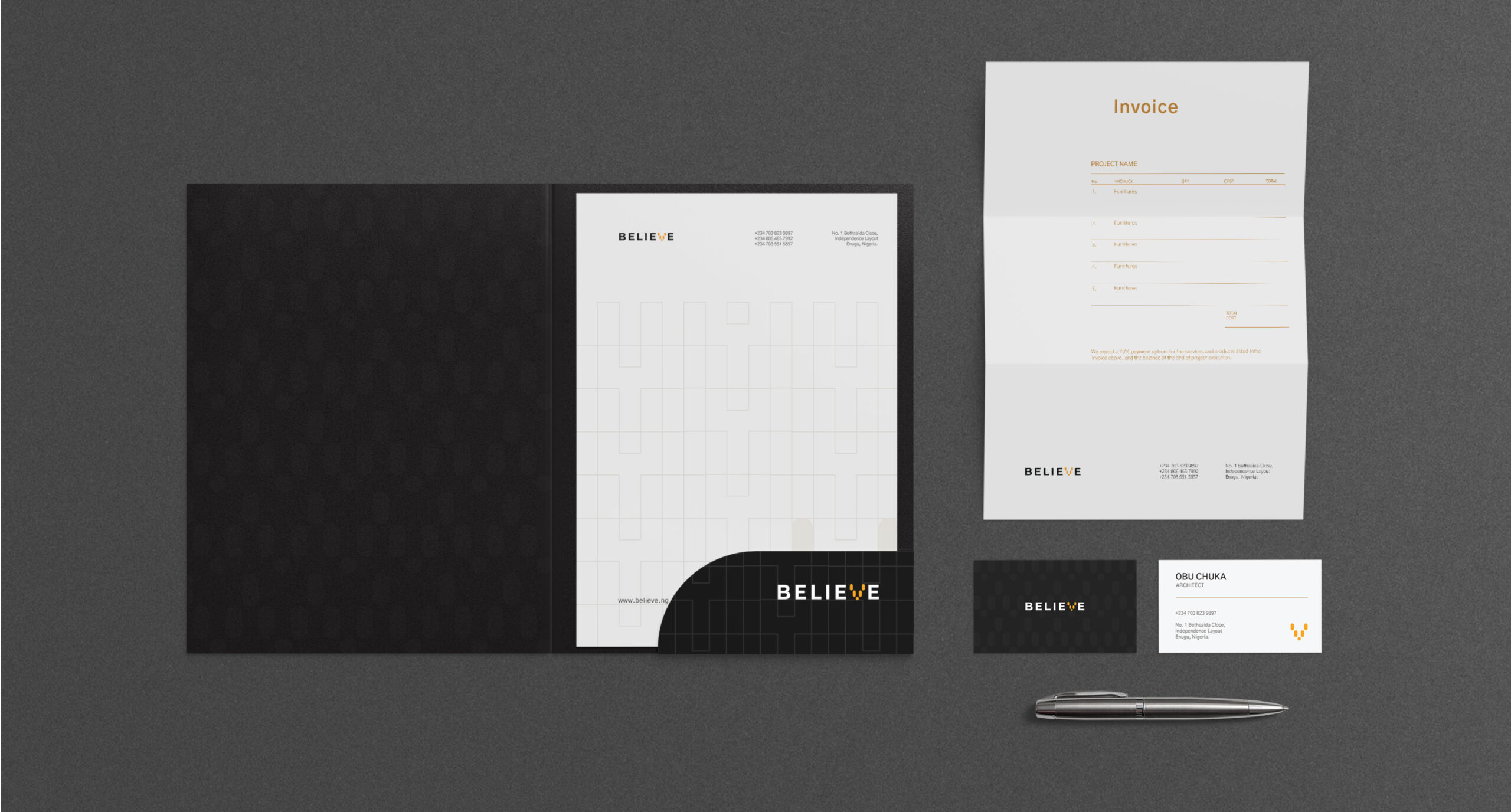
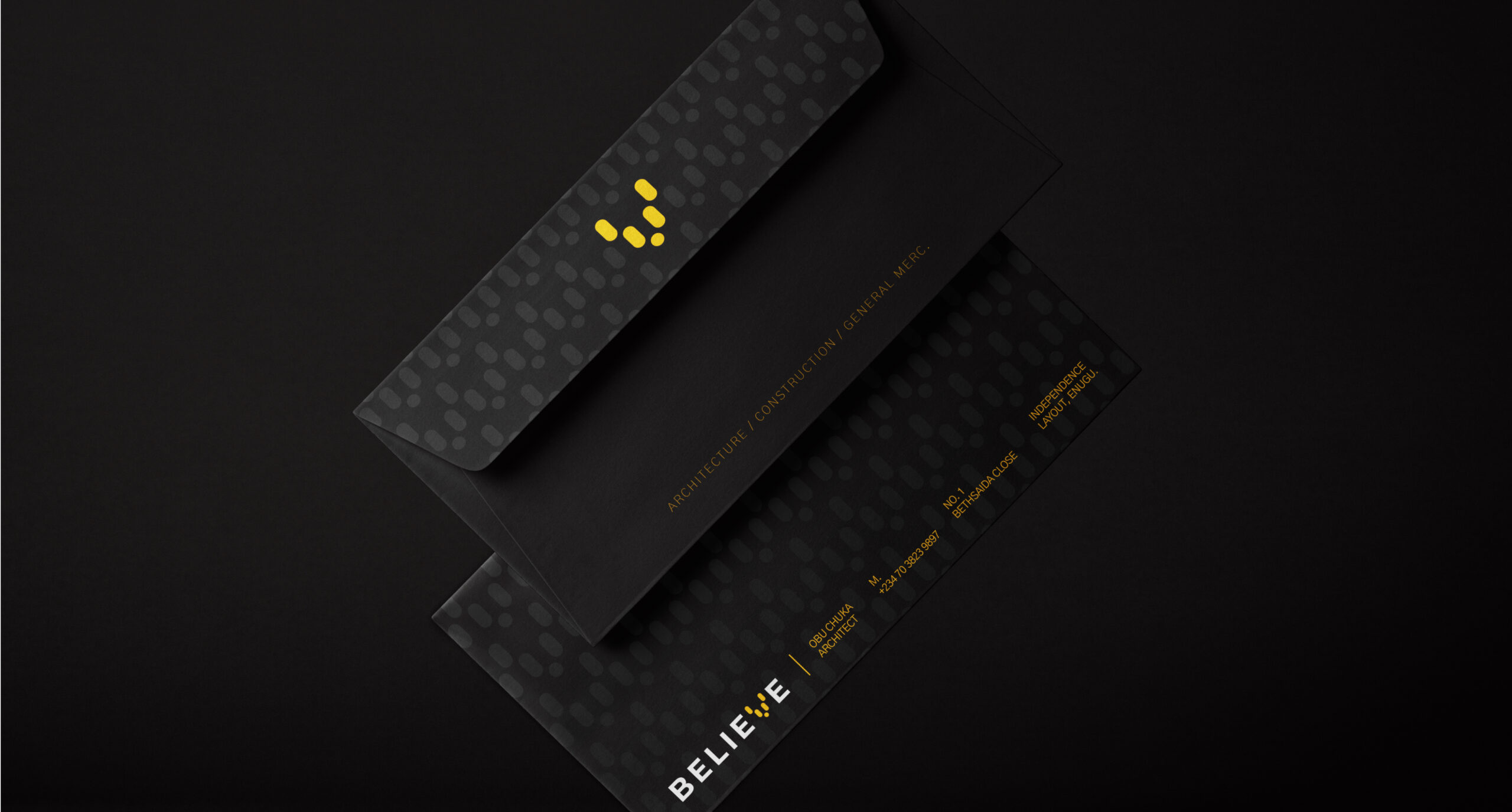
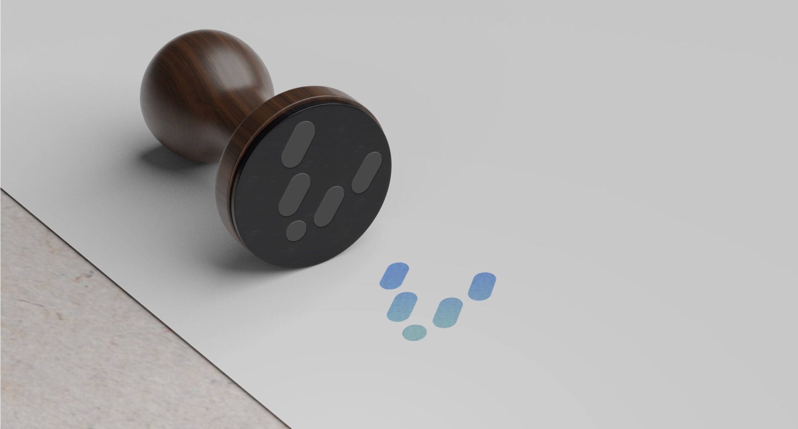
Central to Believe Shelters’ brand identity is their wordmark—a symbol of their commitment to excellence and precision. Designed for communication purposes, particularly in contexts where immediate brand recognition might not be guaranteed, the wordmark serves as an elevated emblem of their brand. Its formal representation conveys assurance and credibility, establishing Believe Shelters as a trusted authority in their field.
But branding is more than just colors and typography; it’s about storytelling and emotion. That’s why we chose yellow and black as Believe Shelters’ primary colors. Yellow symbolizes optimism, innovation, and energy, while black represents strength, sophistication, and authority. Together, they form a dynamic palette that captures the spirit of Believe Shelters’ vision and mission.
For typography, we selected Gothic AI—a font that exudes confidence and precision, perfectly complementing Believe Shelters’ brand voice. Its clean lines and sharp angles instill a sense of assurance and uniqueness, distinguishing Believe Shelters in a crowded marketplace.
In crafting Believe Shelters’ brand identity, we didn’t just design logos and choose fonts; we breathed life into a vision. We captured the essence of who they are and what they stand for, ensuring that every aspect of their brand—from colors to typography—tells a story of inspiration, innovation, and excellence.
As Believe Shelters continue to push the boundaries of construction, we’re proud to have played a part in shaping their journey. Together, we’ve dared to be different, defying convention and paving the way for a brighter, bolder future in the world of construction.